Friday, January 30, 2009

DC Designer Series: Paul Corrie

I'm very pleased to feature interior designer Paul Corrie in my new ongoing series on DC Designers. I first saw Paul's work at the 2008 DC Design House, where he turned a bland lower level hallway into a rich and highly textured art space, featuring carved canoe pieces from New Guinea alongside a 19c french walnut side table. I particularly remember the very well done lighting scheme. (check out the hallway featured in Washington Spaces here) These images with permission from Paul's site - Paul Corrie Interiors - all photography by Michael Crosset of District Creative.
Restrained, elegant, intriguing - just a few adjectives that come to mind when I look at the above living room and this multi-purpose dining/reading space. Love the use of the wall lanterns. A great reminder of what a well placed, over-sized mirror can do.
Wish I could enlarge this photo - it's one of my favorites.
Notice the marble divider on this countertop by the sink - I rather like that idea. The bridge goose faucet is pretty nice too!
Simple shelves elevated in status by the accent pieces and the restraint shown in the arrangement below.

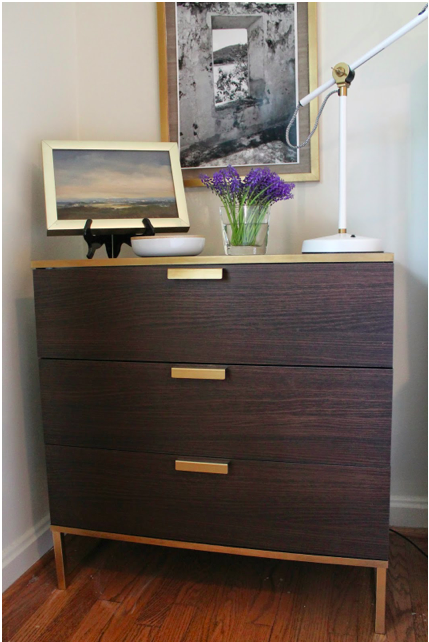
Love, love this dining room. Isn't the patina on this table gorgeous?

Perfect choice for a light fixture in the dining area in the background of the photo. Really like the metal leg feature on this couch.

I always appreciate it when a designer highlights close-ups of the details of their work. You gain a sense of the quality of the pieces they select and the attention to detail. The pale grey of the shade is lovely.
Seriously like these sconces - especially paired with the brown shades.
For more examples - do check out the site of this talented designer.

Wednesday, January 28, 2009

Have you gotten yours yet?

A little over a year ago, January 18th to be exact, I had the good luck to come across Cartolina Cards. I love the sumptous rich colors and beautiful images - and now - in addition to cards there's notebooks!! These recycled 4 X 6 notebooks are available online at Greet Q. Be sure to check them out.


Below is something I just couldn't resist when the most recent email from blue bell bazaar came by. Love this vintage locket - can't wait till it arrives. Hope it looks as good on as it does in this lovely shell.

Sunday, January 25, 2009

Eglomise

The artwork really drew me into this room. As you may already know it is eglomise - a french term meaning glass gilded. Per Wikipedia, it's a "process where the backside of the glass is gilded with gold or metal leaf using a gelatin adhesive. The result is a mirror-like, reflective finish in which designs are then engraved." I think I am more familiar with the poorer cousin version - such as Budweiser mirrors on dormroom walls. Love these striking purple and coral green designs from Soicher Marin (Designer Amanda Nisbet, photography by John Bessler, Traditional Home March 2009)

Modello Designs offers a class called Elegant Inspirations where they teach mirror patination with pattern, glass etching, gilding and reverse painting. The gorgeous image above is via Design Amour, the artist is Regina Guray of Garay Artisans.
image above via Garay Artisans -

image via Design Amour, artist Melanie Royal. Eglomise can also be found in accent pieces and furniture. Here are just a few.


image from 1st Dibs, Mirrored Lantern from C Bell
image from 1st Dibs, Eglomise Chest, Modern One

image from 1st Dibs, sconces, Heather and Company Inc.
image from Mecox Gardens Dallas
My hasty search for eglomise at lower price points didn't yield much (besides small items such as coasters, boxes, etc.) Would love to know if anyone knows of other sources of it - especially framed pieces for a wall.

Friday, January 23, 2009

DC Designer Series: Tracy Morris

One of my goals for this blog in 2009 is to feature more gorgeous interiors that aren't in magazines. To kick it off, I'm going to be focusing on talented D.C. area designers. First up is Tracy Morris of Tracy Morris Design. Love this entry above with the large sunburst mirror and the extra long parsons table. A modern sputnik style light fixture contrasts well with the more traditional elements.
The images below are from a West Palm Beach, Fl project.
This is a very interesting light fixture that really plays up the height in the room. Here again is a very long console table - this one appears to be two placed side by side. I really like that look.

Love the orange boxes!

(all images from Tracy Morris Design and posted with permission)

Tuesday, January 20, 2009

Room Love & "New" Magazines

With the demise of recent magazines, it leaves me searching (as any junkie would) for new sources. How happy I was to come across Hamptons Cottages & Gardens and then to discover they have 3 other sister publications!

Love the pops of orange in the lamp shades and pillows, tempered by the deep brown velvet and all the texture. Interior design by Tom Samet, photography by George Ross.

This light and airy room is featured in Connecticut Cottages & Gardens, design by Brooks & Falotico Associates, Inc. , photography by Nancy Hill

A pretty bedroom featured in Palm Beach Cottages & Gardens, design by Priscilla Ratazzi Whittle, photography by Anastassios Mentis

This creative and colorful room featured in Westchester Cottages & Gardens, design by Debra Geller, photography by Gemma Comas.

So if you're in search of a magazine subscription to replace the now-gone Cottage Living, O at Home, or Country Home (and now Domino too!) - consider one of these four.

Sunday, January 18, 2009

Lost London Photos

Five years ago my husband and I spent a week in London but most of the photos from that trip were lost somewhere in the cyberspace of my hard drive. I just found them today!


If only I had known then I would be blogging I would have taken so many more photos of the interior of the Blakes Hotel where we stayed in Kensington. Designed by Anouska Hempel, every room makes a statement.

Here is a picture of the room we were in the last two nights. I believe it probably has the requisite 10 pillows Barclay Butera would advocate for.


Upon seeking permission from my husband to post the picture below, he said, "I remember that. It was my private frou frou hell!" I completely disagree. However, you might notice how his legs are hanging over the end of the bed so as not to disturb the pillows!

There's a photo of the room we stayed in during the first part of the vacation further down in the post.


The t.v. was housed behind a red silk curtain that you lifted up for viewing. This completely perplexed Dan - "And why is this necessary?" he said.
Here is another photo of the room. If I had known anything about blogging then I would have promptly rolled that portable A/C unit out before I took the picture. It's a white eyesore.

The courtyard

The white door at the end of the courtyard leads to the 007 suite. At the time we stayed there (July 2003) the hotel was popular with musicians and actors.

A street nearby. Below - a photo of Kensington Gardens I think?

Here are some more pics from the hotel's site. Click here to view a slide show of more of the rooms.
Above is the room we stayed in during the first part of the vacation. Love the floors.

So tailored and crisp.

Wednesday, January 14, 2009

First it was the guest room...

The blog world can be a blur but somehow I found my way to Lauren Liess's Pure Style Home, another DC area blogger. First I was drawn in by the guest room re-do for her client and then noticed all the special touches in her son's nursery (photo on the left)


Guest room - Aren't the lamps terrific!
Lauren incorported this existing artwork into the design (below) along with a more abstract piece.

Love this living room below - bright, airy and warm at the same time.


More pics of Lauren's nursery design. Notice the subtle stripes on the wall. Lauren opened her design firm, Pure Style, LLC in 2006 - you can visit her site here.


LinkWithin

Related Posts with Thumbnails